How to Create Custom Error Bars in Google Sheets
Learn how to create custom error bars in Google Sheets in this step-by-step tutorial. Plus, discover alternatives to custom error bars and how to build your data analytics skills.
![[Featured image] Person wearing headphones adds custom error bars on Google Sheets on their laptop.](https://d3njjcbhbojbot.cloudfront.net/api/utilities/v1/imageproxy/https://images.ctfassets.net/wp1lcwdav1p1/7KlDyWEXk3Fcsw0bg1fhe8/cf456e10bb0d1d2dc30ebf0ac7f78cc8/1059700511.jpeg?w=1500&h=680&q=60&fit=fill&f=faces&fm=jpg&fl=progressive&auto=format%2Ccompress&dpr=1&w=1000)
Key takeaways
Custom error bars help you represent your data more accurately and show the variability of the data.
Error bars in graphs represent the confidence level for data points, and the wider the error bars, the less confidence is associated with a particular data point.
Create a custom error bar by inserting a Chart into your Google Sheet, using the Customize > Series option, and then clicking on Error bars.
You can also use alternatives to Google Sheets custom error bars, such as box-and-whisker plots and advanced statistical software.
Follow this tutorial to learn how to add error bars to your graph, customize your error bars, and use alternatives to represent your data in Google Sheets. If you're ready to start earning a credential in data analytics, enroll in the Google Data Analytics Professional Certificate. In this nine-course series led by Google experts, you'll have the opportunity to develop key analytical skills, such as data cleaning, analysis, and visualization, and learn essential tools, including spreadsheets, SQL, R programming, and Tableau. Upon completion, you'll have a shareable certificate that demonstrates you've gained an understanding of the practices and processes used by a junior or associate data analyst in their day-to-day job.
How to add custom error bars in Google Sheets
You can use error bars in graphs to represent the confidence level for the data points. The wider the error bars, the less confidence a particular data point has associated with it. This can help to represent your data more accurately and show the variability of the data. Follow these steps to create error bars in Google Sheets:
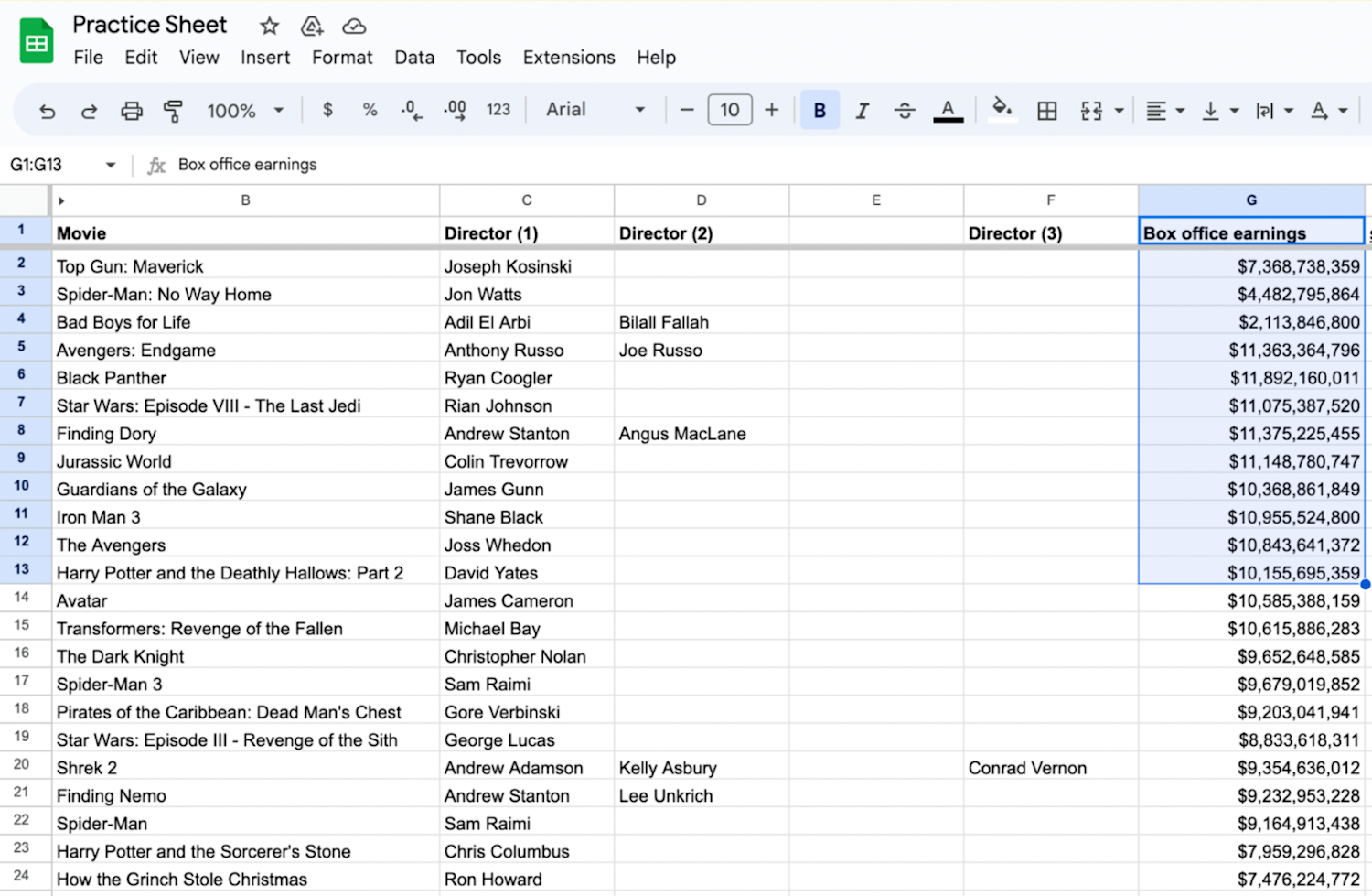
Open your Google Sheet.
Highlight your data.
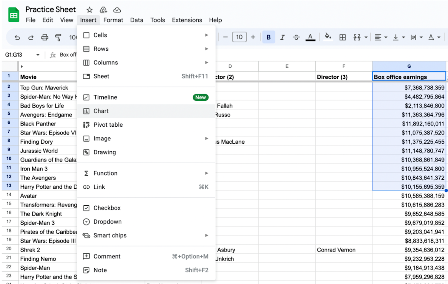
Go to Insert > Chart.
Choose your chart.
Go to Customize > Series.
Click Error bars.
Now, let’s go further into each step.
1. Open Google Sheets.
The first step is to open the Google Sheets spreadsheet with your data in your web browser. If you don’t have data but would like to follow along with this guide, you can open a Google Sheets template or type in temporary values.

2. Organize your data.
In your sheet, organize your data into columns or rows. Next, choose the range of cells you want to include in your chart.
3. Navigate to the Insert menu and click Chart.
Click on the Insert menu at the top and click the Chart option. The Chart editor will open on the right side of your screen.
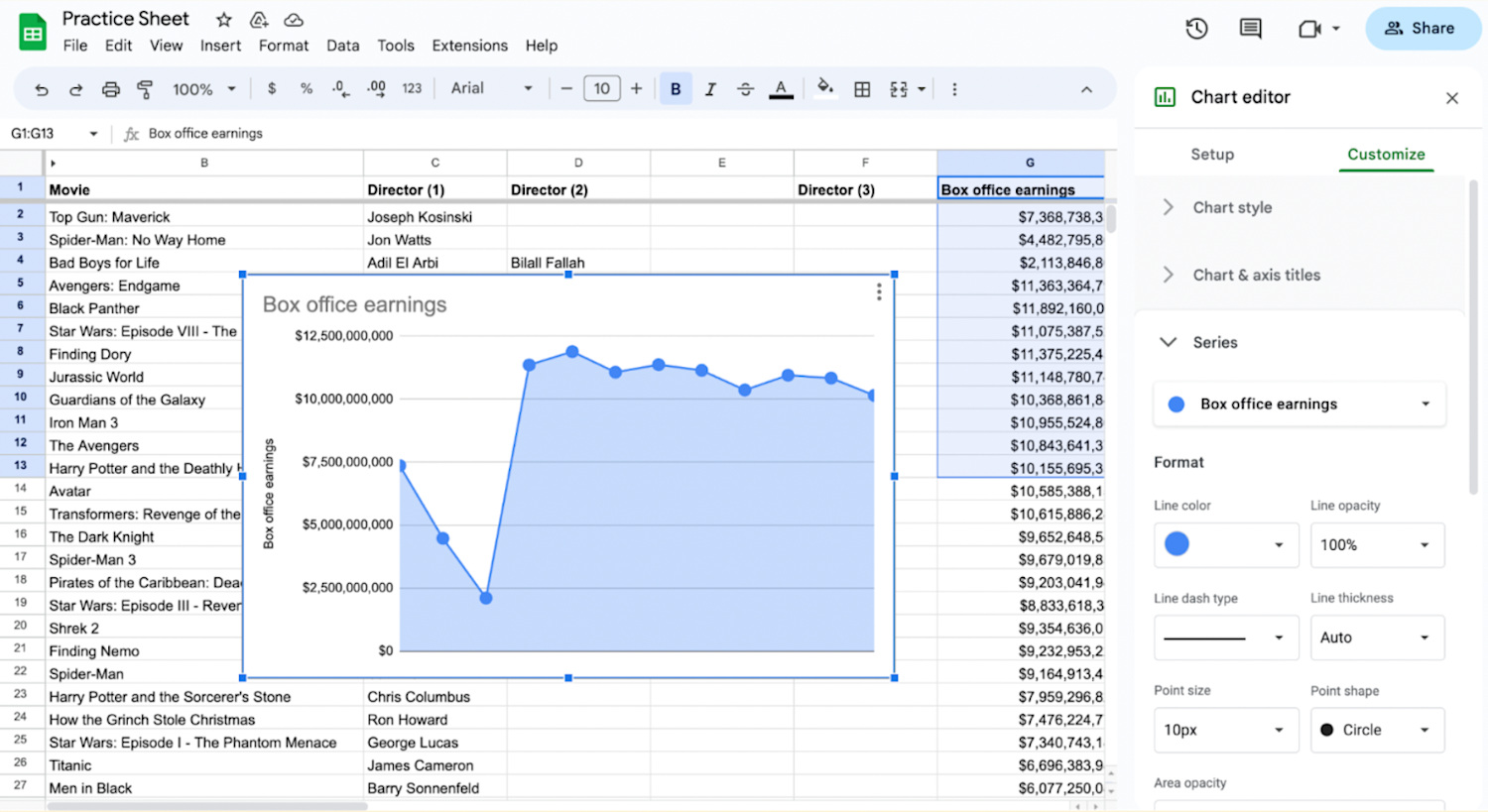
4. Choose your chart within the Chart editor.
Within the Chart editor below the Setup submenu, you can choose the Chart type you prefer for your data. Click on the chart to select it.

5. Go to the Customize tab in the Series section.
In the Chart editor, navigate to the Customize tab. Under the Customize > Series section, click on the drop-down menu next to the series you want to add error bars to.
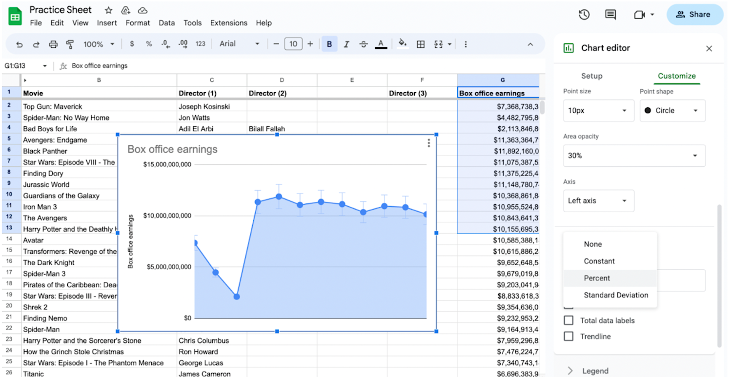
6. Add error bars.
Select the Error bars option in the Customize > Series section.

How to customize error bars in Google Sheets
To customize your error bar appearance, choose the type of error bars you want to add from the available options: Standard deviation, Percent, or Constant. You can adjust the settings to match your data requirements.
For custom error bars, you can select a range of cells containing the error values. You can customize the appearance of the error bars by modifying options such as point size, point shape, and error bar color. Experiment with different settings until you achieve the desired visual effect.
Alternatives to Google Sheets custom error bars
If custom error bars don't meet your needs or if you're working with chart types that don't support error bars, consider these alternatives to show variation in your data set:
Box-and-whisker plots: Consider using box-and-whisker plots to display the distribution and variability of your data. These plots provide a comprehensive overview of data ranges, quartiles, and outliers.
Advanced statistical software: If the limitations in Google Sheets are too restrictive for your analysis, you may consider using specialized data visualization tools or statistical software that offer more advanced options for custom error bars, such as SAS or R.
Learn more: How to Add a Trendline in Google Sheets
How to do error calculations
When you want to understand the accuracy of forecasting results, calculating the error determines the difference between the value you predicted and the actual value seen in the results. Follow these steps to identify the error value:
1. Subtract the actual value from the value you predicted.
2. Divide that number by the actual value.
3. Multiply the resulting value by 100.
For example:
1. 500 (predicted value) - 150 (actual value) = 350
2. 350/500 = 0.7
3. 0.7 x 100 = 70 percent

Learn more about Google Sheets and data analysis with free resources
Keep up with industry trends, certifications, and advice that can help you advance in your career by subscribing to Career Chat, Coursera's LinkedIn newsletter. Then, access these additional free resources for navigating Google Sheets and analyzing data:
Watch on YouTube: 7 Essential Data Analytics Skills for Beginners
Follow a tutorial: How to Make a Graph in Google Sheets
Integrate your software: How to Convert Excel to Google Sheets
Whether you want to develop a new skill, get comfortable with an in-demand technology, or advance your abilities, keep growing with a Coursera Plus subscription. You’ll get access to over 10,000 flexible courses.

Coursera Staff
Editorial Team
Coursera’s editorial team is comprised of highly experienced professional editors, writers, and fact...
This content has been made available for informational purposes only. Learners are advised to conduct additional research to ensure that courses and other credentials pursued meet their personal, professional, and financial goals.