7 UX Designer Portfolio Examples: A Beginner’s Guide
Get inspired by these seven examples of ways to build your UX designer portfolio without formal experience to design a portfolio that will stand out and shine.
![[Featured image] A smiling woman in a black shirt and necklace sits at her laptop and works on her UX portfolio in a brightly lit office.](https://d3njjcbhbojbot.cloudfront.net/api/utilities/v1/imageproxy/https://images.ctfassets.net/wp1lcwdav1p1/4RvUU85SY2zi0AEaKERhu9/dda7c3d68e747984bc543cdae20ee8d9/UX_design_portfolio.png?w=1500&h=680&q=60&fit=fill&f=faces&fm=jpg&fl=progressive&auto=format%2Ccompress&dpr=1&w=1000)
How do you build a UX design portfolio with no experience? This is a common issue for beginning UX designers looking for their first paying job. Luckily, crafting a stellar portfolio that shows off your skills before you’ve ever had a paying client is possible.
In this article, we’ll walk through seven types of portfolio case studies you can add to your portfolio that don’t require you to have a job already. We’ll also examine how working UX designers present these case studies in their portfolios and offer some takeaways and tips for making your portfolio shine.
To get started, let's look at some general guidelines and best practices for your UX design portfolio.
UX case studies for your entry-level portfolio
Just because you’ve never completed UX design work for a paying client doesn’t mean you have to apply for your first job with an empty portfolio. These seven types of UX case studies make excellent portfolio material for UX designers looking to get their start in the industry.
1. The course assignment
Sometimes, the first project to go into your portfolio will be a UX project you worked on as part of a Professional Certificate in UX design, UX boot camp, or degree programme. These projects often simulate real-world situations by giving you the constraints of a brief to work from and teammates to collaborate with.
Including a course assignment or capstone project in your portfolio can demonstrate your ability to:
Work with the constraints and challenges of a brief
Design on a fixed timeline
Collaborate with a team
Incorporate feedback into design iterations
Portfolio example: Phyllis Liu - Autonomous Ridesharing

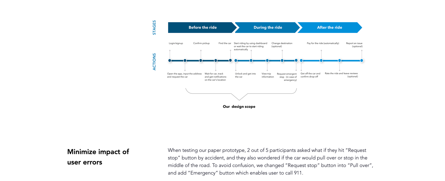
Phyllis Liu, a United States-based UX designer who has worked for Facebook and Shopify, designed an autonomous car ridesharing experience as part of a project for a course at the University of Washington. In her case study, Phyllis is upfront about the project's constraints, along with what her team chose to focus on and why.

Scope of work chart for the case study
For example, the team focused on solving two specific user pain points: finding the car and starting the ride without a driver. The case study walks through the project’s user research, product design iterations, validation through user testing, and user journey map before wrapping up with key takeaways and lessons learnt.
Best practices:
Outline your role in the project and who else contributed. Mention what tasks you worked on.
Be clear about the scope and limitations of your project. What isn’t in the design, and why? Include a section outlining the next steps if you continue the work.
Choose student projects with realistic constraints and real business value. Acknowledge any unrealistic elements in your case study.
Upon completing the Google UX Design Professional Certificate on Coursera, you’ll have three end-to-end projects for your portfolio: a mobile app, a responsive website, and a cross-platform experience.

2. The unsolicited redesign
An unsolicited redesign (sometimes called an uninvited redesign) is an excellent way to show off your skills before you ever land your first job as a UX designer. Pick an app or website you’re familiar with and improve it through your design process.
An unsolicited redesign gives you the structure of an existing product—including an established target user base—while allowing you to work on your user experience skills. This type of project is great for:
Developing UX skills for new designers
Establishing familiarity with the design process
Building your first portfolio case study
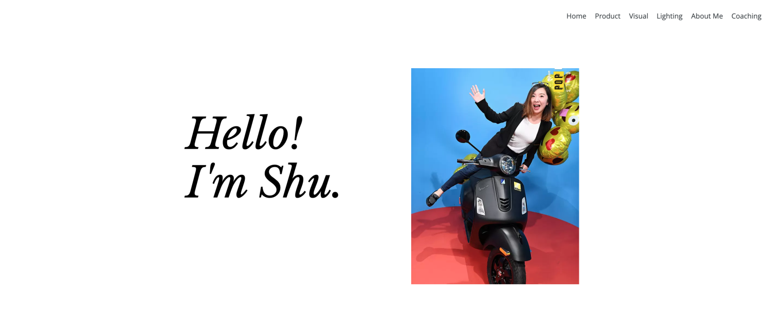
Portfolio example: Shu Jiang - Houzz

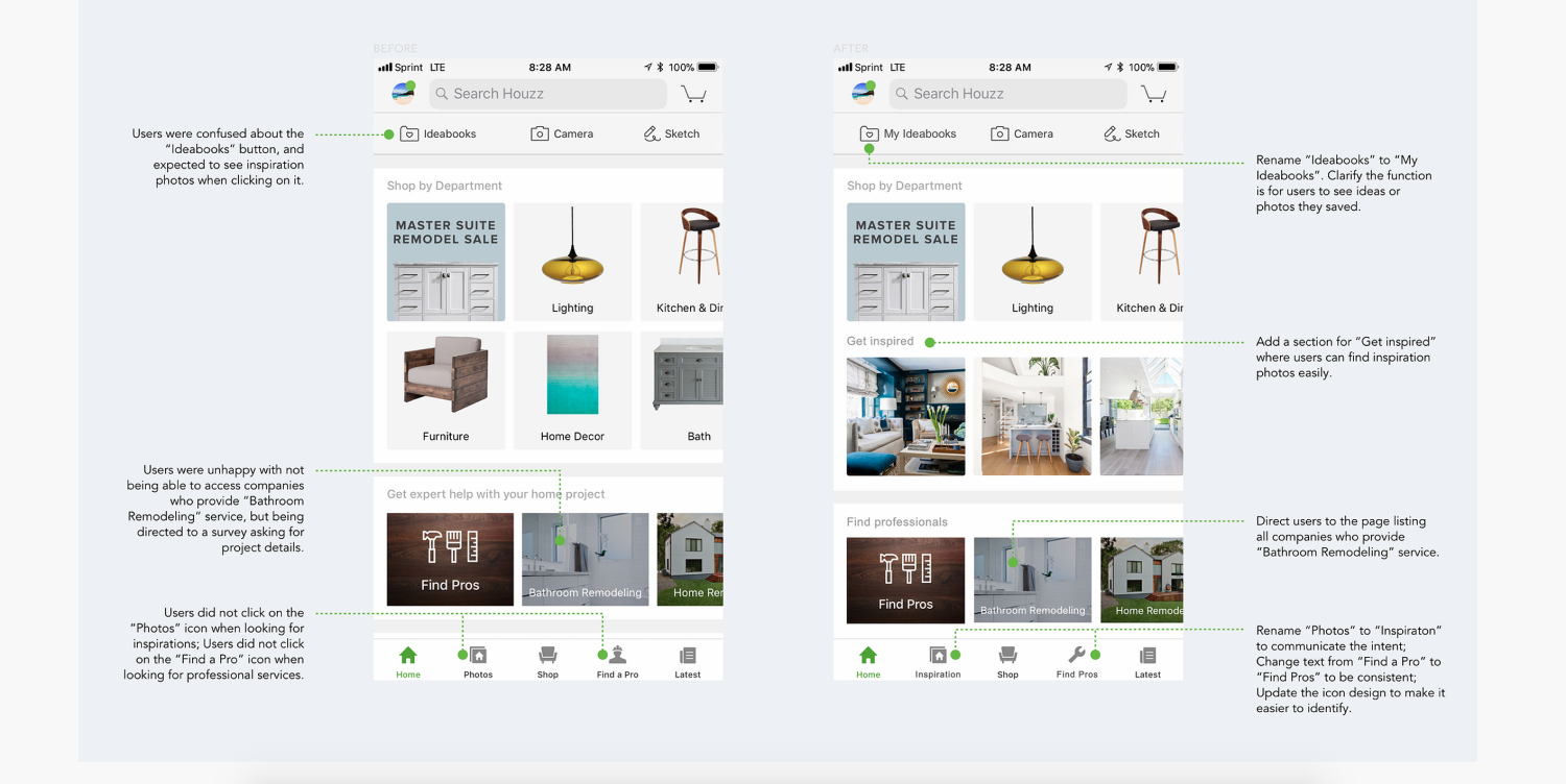
Shu Jiang, a product designer at Google, includes an excellent example of an unsolicited redesign of the app Houzz in her portfolio. She starts by outlining the challenge she set for herself, then walks through the steps of her design process, with plenty of images to document her work.
She includes affinity maps, a user persona, a task flow chart, and low-fidelity, high-fidelity, animated, and clickable prototypes. She even validates her design decisions by testing her clickable prototype with users.

High-fidelity prototypes from an
Best practices:
Clearly indicate that this is an unsolicited redesign and that you have no affiliation with the company.
Work through the entire process, including user research (your friends and family can be your first test subjects). Resist the urge to redesign the interface simply.
Be respectful of the original designers, and try not to insult their work. Remember, they were working with brief and real-world constraints.
3. The passion project
Another option for a case study you can complete without formal UX design experience is to build a concept app or website from scratch. Think about a problem in your own life you wish you had a solution to or an app you’d love to have on your phone. Then, design it.
A passion project can be more challenging than an unsolicited redesign, as it lacks an existing product’s inherent structure and constraints. But it’s also an opportunity to let your creativity shine.
Portfolio example: Jeremy Stokes - Cultivate

Jeremy Stokes is a former Google UX intern and current product designer at Duolingo. His passion project, Cultivate, lays out a clear problem to solve: there’s a stigma around talking about mental health, particularly within the Black community. His solution? A service that uses plant care to empower users to cultivate (and talk about) their mental health.

Jeremy begins his case study by introducing the service. He then takes you behind the scenes to show you his design process. His case study includes his research methods, market analysis, detailed user persona, user journey map, and many early sketches and website iterations.
Jeremy also highlights his visual design strengths with a full brand guide that explains the meaning behind his design choices (including typography, colour palettes, logos, and visuals).
Best practice:
Focus on solving a real problem. Outline that problem and how you solved it in your case study.
When working on a passion project, you may not have a huge budget (or any budget at all). Be sure to mention what you would have done differently if you did.
Choose a project you care about. It’ll make the time and effort you put into it much more worthwhile.
4. The hackathon
During a hackathon, a group of designers and programmers collaborate on a project. The idea is to have a functioning piece of software by the end of the competitive event, which is usually constrained to 24 to 72 hours.
Attending a hackathon allows you to design a real app while collaborating with a real team of other designers, developers, and engineers. A hackathon project in your portfolio can demonstrate that you can:
Think critically and solve problems under pressure
Be a team player
Prioritise essential features and tasks
Example portfolio: Yang Qian - Matchy

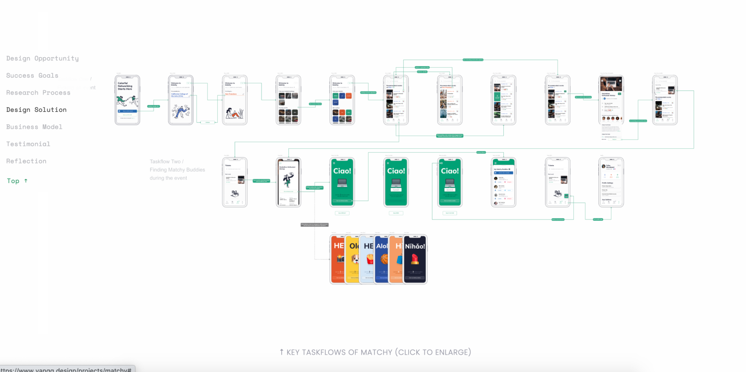
Yang Qian, a product designer at Palantir Technologies, presents a case study from a three-day LinkedIn hackathon for design and engineering students. Her team’s challenge was to design an app to help college students better connect with their classmates. The result? Matchy.
Yang presents the challenge, team, project duration, role, and the skills she used to complete it in a clear and easy-to-read format. This case study does an excellent job of laying out user research findings. Short videos present user task flows in a way that doesn’t rely on big blocks of text.

After the event, Yang even added an illustration showing how the app would bridge the gap between user experience and business value based on feedback from hackathon judges.
Best practices:
Polish your hackathon project before presenting it as a case study (and acknowledge that you did so).
Focus on the process, not the finished product. This is your opportunity to show hiring managers how you think under pressure.
Include positive feedback from the judges, even if your project didn’t win.
5. The volunteer project
Another way to add real client work to your UX portfolio is to complete one or two projects pro bono. Perhaps you could find a nonprofit organisation, school, or small business in your community that could use a website or app redesign.
Remember that many nonprofits and small businesses may need more than just design. They may also need help with development and implementation (and the resources that go with it). In these cases, consider volunteering as a team or doing pro bono work as part of a nonprofit hackathon.
Portfolio example: Clayton Hopkins - #DullesJustice

Clayton Hopkins includes a few pro bono case studies in his portfolio in the form of Medium articles. A particularly interesting example is his website design for a group of lawyers offering free legal aid to travellers at Dulles Airport in response to the Muslim travel ban in 2017.

In addition to walking through the entire UX design process step by step, Clayton offers insights into how he and his team responded to the urgency of the process, lessons learnt along the way, and the results: three days after launch, the number of volunteers had increased from 100 to 1,200.
Best practices:
Choose projects that are fun or interesting to you and that you’d be proud to display in your portfolio.
Avoid signing a non-disclosure agreement (NDA) for unpaid work.
At the end of the project, ask for a letter of recommendation for future jobs.
Looking for a way to volunteer your UX design skills? Check out these sites for opportunities:
-Get matched with a nonprofit project on .
-Join UX Rescue to join more than 6,500 global volunteers working together to create change.

6. The UX design internship
Sometimes, the path toward becoming a UX designer starts with an internship. Companies like Apple, Meta, Google, Amazon, and Airbnb are known to hire interns on their UX teams. You’ll find plenty of benefits to working as an intern—even if you’re unpaid—including:
Mentorship from experienced UX designers
Real-world experience
Behind-the-scenes industry insight
Networking opportunities
Projects for your portfolio
Portfolio example: Ricardo Hernández Pérez, Adobe
Ricardo Hernández Pérez, a product designer with Google, started with an internship at Adobe. Ricardo in a clean, minimalistic way. He gives an outline of the project and an overview of his approach, then walks through research, ideation, design, and presentation.
He includes plenty of colourful visuals to showcase his process and reinforce his text, and he even adds a digital project report booklet where you can get an in-depth look at his research.
Best practices:
If you have to sign an NDA, protect your case study password or keep it general, focusing on early ideation.
Tie your project to business results if possible.
Include a positive testimonial from your manager, supervisor, or peers at the company.
7. The interview design challenge
You’ve landed your first interview for a UX designer role. But that doesn’t mean you can’t keep working on your portfolio. Many interviews include a design challenge—an interactive test meant to show how you think. With a bit of iteration and polish after the fact, you can transform these challenges (especially the take-home ones) into fresh material for your portfolio.
Portfolio example: Tammy Taabassum - Wish Design Challenge

During an interview with the e-commerce platform Wish, Tammy Taabassum completed a four-day design challenge that required her to improve the app. Her project got her an internship and a stellar portfolio piece.

Usability testing results chart for a
Tammy presents her case study as a slide deck that lays out the challenge and the four steps of her design process. She digs into the insights and challenges uncovered during her user research, points back to other apps where she found inspiration and ideas, redefines the Wish app’s information architecture, and validates her design with usability testing. She also discusses how she would test and iterate with more resources, giving her interviewers a preview of the value she’d bring to the company.
Best practices:
If you received feedback during your challenge, include it in your case study and show how you incorporated it into your design.
Take photos of your work when completing a whiteboard challenge during an interview.
Make clear that this was a design challenge so recruiters know the limitations, such as time constraints.
What should be in a UX design portfolio?
In many cases, your UX design portfolio should have three sections: a Home Page, an About page, and a collection of case studies (this page is often labelled Work).
Home
Your homepage should include a compelling headline introducing yourself and your work. Sometimes, one sentence, an image, and a straightforward navigational menu are enough.
About
Your About page is the place to describe yourself in more detail and explain how you got started in UX, especially if you’ve switched careers.
Work
Early in your UX journey, you may not have much design work to include in your portfolio. But as you take classes, participate in hackathons, and work through passion projects, your collection of materials will start to grow.
While there’s no hard and fast rule about the number of projects to include in your portfolio, consider featuring three to five in-depth case studies. These should be your best work; you can always swap them out for new case studies as you gain experience.
For each, consider including:
Project context, scope, and timeline
Your role and list of collaborators
The problem you set out to solve
Method or hypothesis for solving the problem
Primary and secondary research
User research and findings
User persona and user journey map
Design iterations (sketches, wireframes, low and high-fidelity prototypes)
Final product
Conclusion and metrics of success
Lessons learnt
Optional sections
Depending on your amount of experience and personal preferences, you may also choose to include the following pages:
CV: Give it its own page on the site or link to it.
Side projects or other work: If you have case studies or graphic design work beyond your few highlighted projects, give them a separate section where those who want to see more can find them.
Contact: This doesn’t have to be its own page, but be sure to give recruiters a way to contact you after you’ve impressed them with your work.
UX portfolios: Choosing a platform
Having your own hosted website can often be worth the extra expense. But if you’d like to get started building a portfolio for free, these platforms can help you showcase your work:
1. Behance offers a free online portfolio platform for creative work, including UI, UX, and graphic design.
2. Dribbble, another popular UX portfolio platform, lets you share screenshots of your sketches, prototypes, and design concepts.
3. Adobe Portfolio is free with most Adobe Creative Cloud plans and allows you to create a customised site that synchronises with Behance.

How do I make my portfolio stand out?
Now that we’ve reviewed the must-have sections of a UX portfolio and some examples of compelling case studies, let’s review some additional tips and best practices for building your portfolio.
Showcase your process, not just the finished product. Include all the steps.
Document your process and include visuals in your case studies. Show your design process in action through photos, sketches, and screenshots.
Use emotive language to show empathy. It is particularly important to provide background on the problem you are setting out to solve.
Tie great UX back to business value (how does solving a user problem positively impact the business?).
Highlight your speciality. If you aim to be a generalist, choose projects where you worked on all elements of the design process. If you’re more interested in user research or user interface (UI) design, prioritise these elements in your case studies.
Make sure your portfolio provides a good UX. Your portfolio website is itself a demonstration of your skills.
Try to include at least one live case study. Some work may need password protection due to NDAs, but you want to give recruiters something to look at without emailing you for a password first.
Get started in UX design.
If you’re curious about UX design or are ready to take the next step toward a new career in user experience, enroll in the Google UX Design Professional Certificate on Coursera. You can learn the skills you need for an entry-level role in less than six months, with no degree or prior experience required.
Coursera Staff
Editorial Team
Coursera’s editorial team is comprised of highly experienced professional editors, writers, and fact...
This content has been made available for informational purposes only. Learners are advised to conduct additional research to ensure that courses and other credentials pursued meet their personal, professional, and financial goals.