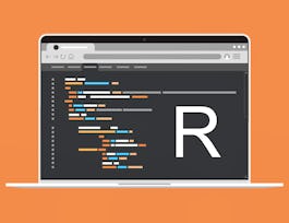
Data visualization is a critical skill for anyone that routinely using quantitative data in his or her work - which is to say that data visualization is a tool that almost every worker needs today. One of the critical tools for data visualization today is the R statistical programming language. Especially in conjunction with the tidyverse software packages, R has become an extremely powerful and flexible platform for making figures, tables, and reproducible reports. However, R can be intimidating for first time users, and there are so many resources online that it can be difficult to sort through without guidance.


Advanced Data Visualization with R
This course is part of Data Visualization & Dashboarding with R Specialization

Instructor: Collin Paschall
Sponsored by Barbados NTI
5,674 already enrolled
(74 reviews)
Details to know

Add to your LinkedIn profile
6 assignments
See how employees at top companies are mastering in-demand skills

Build your subject-matter expertise
- Learn new concepts from industry experts
- Gain a foundational understanding of a subject or tool
- Develop job-relevant skills with hands-on projects
- Earn a shareable career certificate


Earn a career certificate
Add this credential to your LinkedIn profile, resume, or CV
Share it on social media and in your performance review

There are 3 modules in this course
In this module, we will work through making a number of different figures using ggplot2 and a few additional R packages. You should begin by watching the introductory videos in each lesson. Then, carefully review the readings and reference materials provided. Once you have done that, I recommend watching the videos again to check your understanding. You will take a few quizzes as you progress through the material to make sure you are keeping up.
What's included
3 videos12 readings3 assignments1 peer review
In this module, we go through an introduction for making spatial figures (maps) in R. You should begin by watching the introductory videos in each lesson. Then, carefully review the readings and reference materials provided. Once you have done that, I recommend watching the videos again to check your understanding. You will take a few quizzes as you progress through the material to make sure you are keeping up.
What's included
4 videos5 readings1 assignment1 peer review
In this module, we will work on animating figures and making them interactive. You should begin by watching the introductory videos in each lesson. Then, carefully review the readings and reference materials provided. Once you have done that, I recommend watching the videos again to check your understanding. You will take a few quizzes as you progress through the material to make sure you are keeping up.
What's included
5 videos4 readings2 assignments1 peer review
Instructor

Offered by
Why people choose Coursera for their career


Learner reviews
74 reviews
- 5 stars
86.48%
- 4 stars
13.51%
- 3 stars
0%
- 2 stars
0%
- 1 star
0%
Showing 3 of 74
Reviewed on Apr 20, 2021
It's a very good course and you'll learn a lot of topics related to advanced visualizations.
Reviewed on Jul 15, 2021
This course help me in doing my assignments with beautiful colors of graphs etc. I love it.
Reviewed on Aug 15, 2021
My skills have vastly improved in R with this specialization. I've utilized on multiple occasion the tasks here in my professional job.
Recommended if you're interested in Data Science

Open new doors with Coursera Plus
Unlimited access to 10,000+ world-class courses, hands-on projects, and job-ready certificate programs - all included in your subscription
Advance your career with an online degree
Earn a degree from world-class universities - 100% online
Join over 3,400 global companies that choose Coursera for Business
Upskill your employees to excel in the digital economy


