- Plotly
- Data Visualization
- Data Visualization Software
- Data Science
- Interactive Data Visualization
- Dashboard
- Data Manipulation
- Web Applications
- Pandas (Python Package)
- Data Analysis
- Python Programming
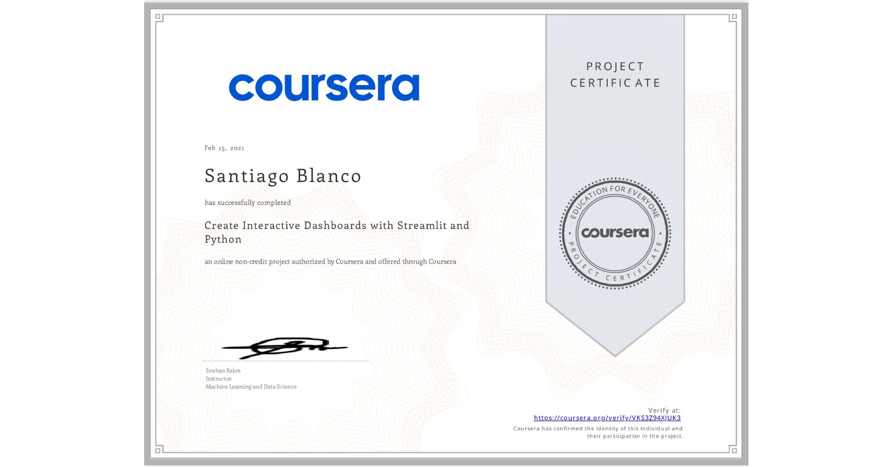
Create Interactive Dashboards with Streamlit and Python
Completed by Santiago Blanco
February 15, 2021
2 hours (approximately)
Santiago Blanco's account is verified. Coursera certifies their successful completion of Create Interactive Dashboards with Streamlit and Python
What you will learn
Build interactive data dashboards with Streamlit and Python
Use Pandas for data manipulation in data science workflows
Create interactive plots with Plotly Python
Skills you will gain

