- Histogram
- Ggplot2
- Box Plots
- Data Visualization Software
- Data Storytelling
- Exploratory Data Analysis
- Data Presentation
- Plot (Graphics)
- R Programming
- Scatter Plots
- Data Manipulation
- Animations
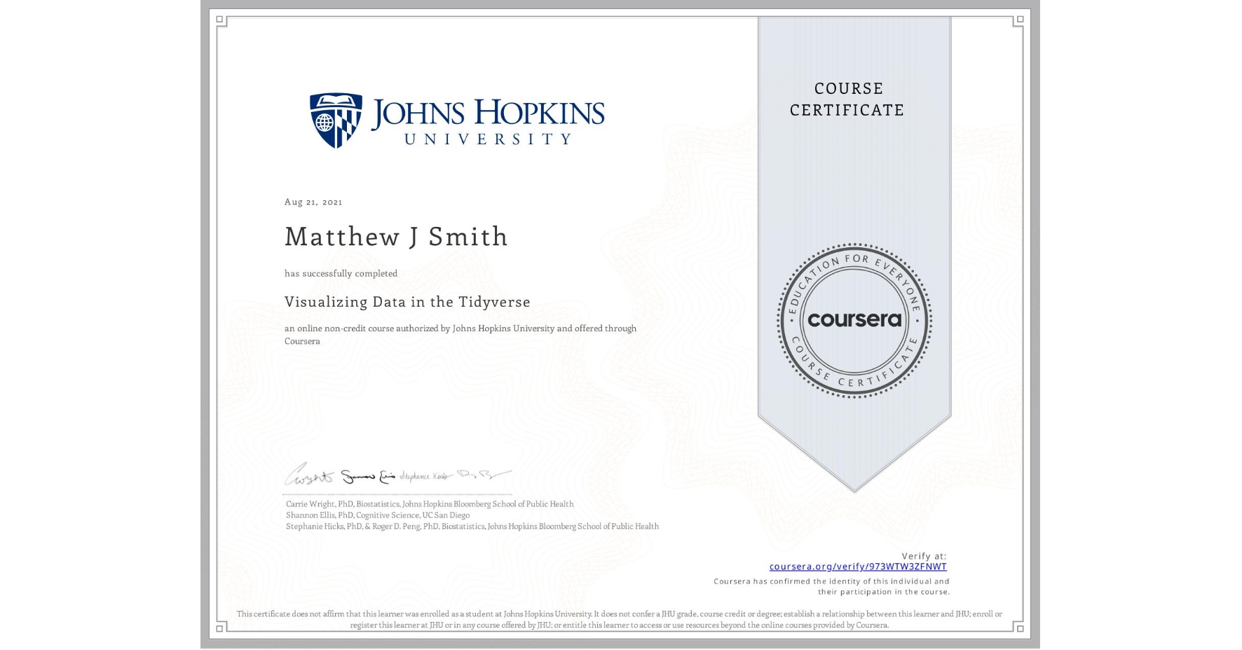
Visualizing Data in the Tidyverse
Completed by Matthew J Smith
August 21, 2021
16 hours (approximately)
Matthew J Smith's account is verified. Coursera certifies their successful completion of Visualizing Data in the Tidyverse
What you will learn
Distinguish between various types of plots and their uses
Use the ggplot2 R package to develop data visualizations
Build effective data summary tables
Build data animations for visual storytelling
Skills you will gain

