
Filter by
The language used throughout the course, in both instruction and assessments.
Results for "interactive+dashboards"
 Status: Free
Coursera Project Network
Skills you'll gain: Power BI, Interactive Data Visualization, Data Visualization, Data Presentation, Dashboard, Trend Analysis, Exploratory Data Analysis, Customer Analysis, Data Visualization Software, Sales, Business Intelligence, Data Analysis, Regional Sales, Data Import/Export
Skills you'll gain: Dashboard, Data Import/Export, Business Intelligence, Google Cloud Platform, Data Integration, Database Development, Big Data, Query Languages
 Status: Free
University of London
Skills you'll gain: Graphical Tools, Media Production, Virtual Environment, Technology Solutions
Coursera Project Network
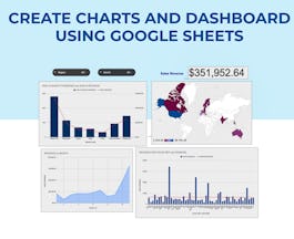
Skills you'll gain: Dashboard, Google Sheets, Spreadsheet Software, Pivot Tables And Charts, Data Visualization, Data Visualization Software, Data Presentation, Interactive Data Visualization, Excel Formulas, Data Cleansing, Data Manipulation

Corporate Finance Institute
Skills you'll gain: Data Analysis Expressions (DAX), Power BI, Data Modeling, Business Intelligence, Microsoft Excel, Pivot Tables And Charts, Spreadsheet Software, Data Analysis Software, Data Manipulation, Time Series Analysis and Forecasting
 Status: Free
The University of Tokyo
 Status: Free
Illinois Tech
Skills you'll gain: Capital Budgeting, Data Visualization, Microsoft Excel, Dashboard, Business Intelligence, Interactive Data Visualization, Excel Formulas, Productivity Software, Financial Analysis, Spreadsheet Software, Pivot Tables And Charts, Key Performance Indicators (KPIs), Google Sheets, Business Analytics, Financial Modeling, Financial Management, Accounting and Finance Software, Microsoft 365, Data-Driven Decision-Making, Data Analysis Software

Johns Hopkins University
Skills you'll gain: Rmarkdown, Shiny (R Package), Ggplot2, Tidyverse (R Package), Data Visualization, Spatial Data Analysis, Scatter Plots, Plot (Graphics), Dashboard, Data Import/Export, Data Visualization Software, Interactive Data Visualization, R Programming, Geospatial Information and Technology, Statistical Reporting, Plotly, Statistical Visualization, Data Storytelling, Heat Maps, Data Manipulation

Skills you'll gain: IBM Cognos Analytics, Data Visualization, Dashboard, Business Intelligence, Interactive Data Visualization, Data Presentation, Looker (Software), Data Visualization Software, Business Intelligence Software, Data Analysis, Analytics

Skills you'll gain: User Centered Design, Responsive Web Design, Web Design and Development, Prototyping, Front-End Web Development, User Interface and User Experience (UI/UX) Design, Figma (Design Software), Design Elements And Principles, Wireframing, Typography, UI Components, Web Applications, Mobile Development

Corporate Finance Institute
Skills you'll gain: Dashboard, Tableau Software, Interactive Data Visualization, Data Visualization Software, Data Presentation, Data Modeling, Data Storytelling, Data Manipulation, Data Import/Export, Business Intelligence, Data Transformation, Data Integration, Data Analysis, Business Metrics
In summary, here are 10 of our most popular interactive+dashboards courses
- PowerBI for Beginners: Sales Data Exploration: Coursera Project Network
- How to Build a BI Dashboard Using Google Data Studio and BigQuery: Google Cloud
- Get Interactive: Practical Teaching with Technology: University of London
- Create Charts and Dashboard using Google Sheets: Coursera Project Network
- Intermediate DAX & Time Intelligence: Corporate Finance Institute
- Interactive Teaching(インタラクティブ・ティーチング): The University of Tokyo
- A Comprehensive Excel Masterclass: Illinois Tech
- Data Visualization & Dashboarding with R: Johns Hopkins University
- UI Automation and Selectors: UiPath
- BI Dashboards with IBM Cognos Analytics and Google Looker: IBM


