YM
4.0Reviewed Jan 5, 2022
It is good for beginners to know basics and get acquainted with the steps of making a dashboard. The instructor spoke clearly. One issue, the workplace sometimes had lagging issues.
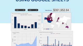
In this 2-hour long project-based course, you will learn how to create effective charts and a dynamic dashboard to visualize data sets. You will be able to work with vlookups, pivot tables and basic formulas and be able to create dynamic charts, sparklines, and a robust, dynamic dashboard to present the data. By the end of the project you will be able to: - Understand the terminologies of spreadsheets - Work with basic formulas in Google Sheets - Create 8 Basic Charts for visualizing data - Generate Dynamic Charts from a dropdown list - Generate Sparklines to represent data - Build a dashboard and introduce Basic and Advanced Charts - Use Slicers to filter data and create a robust and dynamic dashboard Note: If you don't have a Google account, you will need to create one to be able to complete the content.
YM
It is good for beginners to know basics and get acquainted with the steps of making a dashboard. The instructor spoke clearly. One issue, the workplace sometimes had lagging issues.
R
The instructions were easy to understand and work alongside. However, only 8 quiz questions are not enough to evaluate the learning.
NT
It was really Great Guide project for beginners ,Those who want the basic knowledge or Good Foundation in this particular Topic .I learnt a Good Basic Knowledge regarding this topic.
LC
the cloud worksheets was a struggle because operation was slow... I don't know if the problem was with my laptop or it is naturally slow. But overload, it was very informative
TN
An extremely helpful and intuitive tutorial. I've learned a lot by the end of the course. Many thanks to the instructor and Coursera for this free guided project.
AA
A lot of new information and the opportunity to create and exercise from scratch. I truly recommend it!
MM
Excellent Way to learn about the charts and Dashboard using Google sheets. I learned a great deal about these Items that I knew exsisted but was never taught how to create!!
JF
Perfect intro. The instructor made things clear and gave different samples in the guided project to give enough opportunities to try the skills.
MD
An amazing course that gives you knowledge as well as instills curiosity for life-long learning in the field of Data Visualisation.
SS
It was great experience to learn , how to use Google-sheets. Instructor guide me very well. i recommended this course to everyone who wanted to enhance their IT skills.
YA
The instructor explained things well to understand, but I encountered a few technical problems form my end. I plain to earn a certificate.
HT
This course will make you ready to some new skills like data analyse and data science. It was good for me and I'm really like that.
Showing: 20 of 135
The instructions were easy to understand and work alongside. However, only 8 quiz questions are not enough to evaluate the learning.
Hard to concentrate as I had to try hard figuring out what the instrucor's saying.
I think her Google Suite is out of date. I couldn't follow right along with her. I had to search for the functions on my computer.
The video would not load and I was unable to complete the course. I was able to immediately afterwards complete another course but this one is not allowing the video to play, interfering with my ability to complete the course.
i missed the actual learning parts and went straight to the final quiz.... and now i cant unenroll. the steps are not clear.
Instructor was great and material was interesting and presented well. The live or virtual environment that was used to access Google Sheets from my Google account, was ok, and seemed abit slow. I decided to access my Google account directly instead of using the live or virual login, and that worked much faster for me. The login for the virtual account actually would not allow me back in after a few sessions. Anyway I was able to complete the guided project, and enjoyed doing it. I am an intermediate spreadsheet user and was interested in seeing what creating dashboards is about. This project answered my questions, gave me ideas, and sparked my interest to learn more. Thank you!
By fat the most comprehensive project on the topic of Google Sheets. The Instructor was easy to understand and comprehend and the project was smoothly conducted. Great work and looking forward to more such projects with the instructor.
Thoroughly enjoyed working on this guided project. Though, the cloud workspace was a bit slow along the way, maybe due to my internet connection (not sure), I appreciate the effort it took to bring this to us.
Thanks for this dashboarding journey, I really enjoyed doing this project. With a professional person and easy follow-up of,you will not get lost and will take advantage of learning something really useful.
learnt about a lot of variations in data visualisation. Some of the things I have always struggled in in having multiple Y axes, geo chart etc. are very well explained. Learnt a lot of formulas too
Excellent Way to learn about the charts and Dashboard using Google sheets. I learned a great deal about these Items that I knew exsisted but was never taught how to create!!
It was great experience to learn , how to use Google-sheets. Instructor guide me very well. i recommended this course to everyone who wanted to enhance their IT skills.
An extremely helpful and intuitive tutorial. I've learned a lot by the end of the course. Many thanks to the instructor and Coursera for this free guided project.
Impressed with how applicable the course was. The teacher is very informative and shares many useful formulas/charts using real business scenarios.
Nice guided project, quick and well explained.
Good choice if you want to do a quick project or learn chart and dashboard basics on Google Sheets
Perfect intro. The instructor made things clear and gave different samples in the guided project to give enough opportunities to try the skills.
The instructor explained things well to understand, but I encountered a few technical problems form my end. I plain to earn a certificate.
This course will make you ready to some new skills like data analyse and data science. It was good for me and I'm really like that.
An amazing course that gives you knowledge as well as instills curiosity for life-long learning in the field of Data Visualisation.
A very easy to understand training course to help bost and improve your knowledge about spreadsheets and using custom formulas.